WeblinkIndia logo
+91-9811948545 Get a Call Back

Responsive Website Design

You Need A Responsive Website:
To Top Google SERPs
Make Conversions On The Go

Make Your Website Flawlessly Fit Into Every Screen Dimension

In 2018 51.2% of total global online traffic is coming through mobiles. This traffic is highly convertible as almost 88% of such users contact or make a purchase within 48 hours of making a search. At the same time this traffic is equally impatient as 61% of such users do not prefer to return to the site if they face trouble in browsing like if they had to zoom or squint the content or image to view it properly. 40% of such users switch to a competitor site. Therefore websites that can be accessed on every device and flawlessly adjust to the pixel-width of the screen on which they are viewed without compromising user experience are indispensable in this “Mobile-First” age. We design responsive websites that are optimized for all devices, have a single URL and HTML code thus work flawlessly on all modern devices like, tablets, smartphone, kindle, phablets etc.

Features Of Our Responsive Websites

Fluid Layout

Fluid Layout

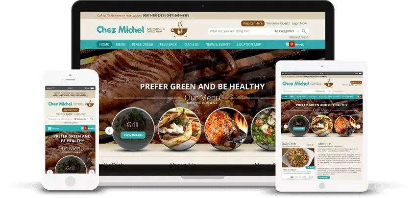
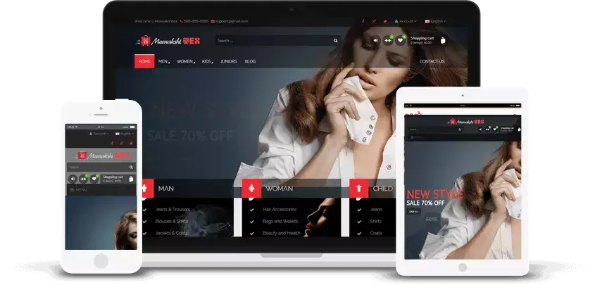
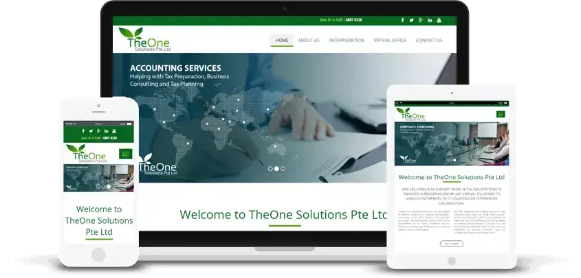
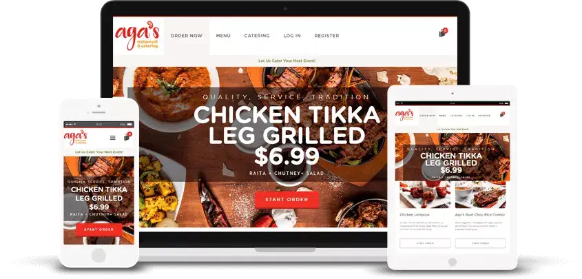
Our responsive layout fits perfectly into the four corners of every digital platform, not just the screen dimensions of a single device.
Unrivalled Performance

Unrivalled Performance

With a responsive layout, we promise our clients a website that performs under all the conditions, along with looking stunning across every device.
Browser Compatibility

Browser Compatibility

The Responsive websites we create are programmed to run efficiently on almost every web browser including iOS, chrome, windows phone, safari, etc.
Fits Into Every Width

Fits Into Every Width

With a fluid and responsive web design that falls into the dimensions of all screen sizes perfectly; you don’t have to worry about a new screen size breaking your website's flow!
Device Agnostic

Device Agnostic

Our main aim is to deliver the client a responsive website with optimum UX, irrespective of the device that the user is working on.
Rich UX

Rich UX

Our responsive websites are designed exclusively for solving the problems of a real person by providing optimum user experience throughout.

How Responsive Website Helps Your Business

01

One For All

Responsive Websites mold according to the device on which they are viewed. With this option, you are required to maintain only one website, which provides an optimal browsing experience across a wide range of digital media platforms.

02

Capture More Audience

On an average, close to 50% of websites traffic comes from mobile devices. If your website is loading slowly, has difficult-to-read text and misfit images, chances are, a mobile user would simply switch to some other website immediately.

03

Upsurge Online Presence

A significant share of your target audience is viewing websites using mobile devices. If you do not have a Responsive Website the visitors landing on your website will leave it in first few seconds. The bottom line is you miss the opportunity for conversions.

04

No Duplicate Content

With responsive layout, you are required to maintain only one website, which provides an optimal browsing experience across a wide range of digital devices; hence, no chances of having duplicate content on websites which may confuse users.

05

Economical

Maintaining a single website is economical than building a different website for users accessing your website across a wide range of digital platforms including desktops, tablets, smartphones, etc.

We Build responsive website design with latest treands

The staggering growth in the number of users who access the Internet on digital mobile devices constitutes a big target market, and to tap it you need a Mobile-responsive or Mobile-friendly Website, one that molds to the device the visitor is using and delivers optimal viewing experience and usability. We understand the rapidly evolving mobile landscape and specialize in designing and developing invariably all types of Responsive Websites.

Why Choose Weblinkindia.Net For A Responsive Website?

Mobile users want "it" quick! They don't wait and watch your mobile website loading for 10 seconds. They love the sites that are simple to understand and use with minimum resizing, panning and scrolling. Keeping all this in mind, the proficient developers at our web designing company build a responsive web design with nonpareil graphic design concepts & UX that offer the visitors a unique and interactive experience, with fluid Grids and flexible Media including image, video and audio files grow and shrink as per the screen size and resolution.

Our Responsive Website Designing & Development Process:

  • Track With Analytics

    Track With Analytics

  • Wireframe The Layout

    Wireframe The Layout

  • Be Thumb-Friendly!

    Be Thumb-Friendly!

  • HTML/CSS Expert Review

    HTML/CSS Expert Review

  • UI/UX Testing

    UI/UX Testing


What Screen Resolutions Are Relevant for Responsive Web Design?

Mobile Portrait

(320x480)

Mobile Landscape

(480x320)

Phablet Portrait

(360x640)

Phablet Landscape

(640x360)

Tablet Portrait

(768x1024)

Tablet Landscape

(1024x768)

PC Browser

1024 onwards

Frequently Asked Questions (FAQ’s)
about Responsive Web Design

Responsive web design is an approach to web development that makes web pages render well on a variety of devices and screen sizes by using flexible layouts and CSS media queries.
It's important because it provides a consistent and user-friendly experience across devices, improves mobile usability, and can positively impact SEO rankings since Google prioritizes mobile-friendly websites.
A mobile-first approach involves designing and building a website starting with the mobile version, and then progressively enhancing it for larger screens. This approach ensures a good experience on smaller screens.
Media queries are CSS rules that allow you to apply different styles to a web page based on characteristics like screen width, height, and orientation. They are essential for creating responsive layouts.
You can test your website's responsiveness by resizing your browser window, using browser developer tools to simulate different devices, or using online tools like Google's Mobile-Friendly Test.

What Our Clients Says


Featured Responsive Web Design Projects