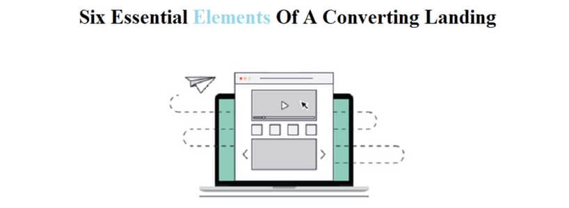
A number of elements go behind the crafting of a highly converting and competition-crushing landing page. But the question is, where do you find these elements.
Over the years, digital marketers have avowed to certain best practices for a landing page that are bound to increase conversions. Lurking beneath the surface of a high converting landing page are the elements that establish a great first impression and turns any prospect into a lead. A great way to hedge your bets and boost your landing page conversion rates is to pick out the most compelling elements of these pages and incorporating them into your landing page design. In this write-up, I have compiled the six elements that would help you build a robust framework for your landing page and engage the users to finally convert them into successful leads. Read on to find out.
Powerfully Effective CTA
The most important element of a landing page is its CTA. No element on your landing page is as important as your call-to-action button. The main agenda of having a landing page is to get conversions, and effective call-to-actions ensure just that. The bigger, exciting and persuasive CTA you have on your landing page, the better. Choose a contrasting color for your CTA that stands out from the background color or images and grabs instant attention. The copy on the CTA button should compel the user to click. The landing pages of Monetate and Monsoon have two of the most powerfully effective CTAs.
Attractive Headline
The interest, attention, and understanding of the user begin from the headline on the landing page. A compelling and attractive headline would ensure that the user does not bounce immediately after landing and encourages them to read further about the offer. Clarity, relevance, and empathy are the three key points that should reflect in your headline. It should be eye-catchy and informative at the same time. Moreover, the headline on the landing page should be in sync with the ad that compelled the user to land here. MailChimp and PictureMarketing have the most attractive and attention grabbing headlines on their landing pages.
Captivating Images And Videos
A picture is worth a thousand words, but did you know that a human brain can process images, especially moving graphics, almost 60,000 times faster than any other form of written content. Putting captivating images and interesting videos on the landing page would immediately grasp the fancy of the user and affect their understanding. A large and bold image that is relevant to the proposition presented on the landing page is a must have. If adding a video, keep it short and compelling to add human appeal and even evoke emotions for the brand. Shutterstock and SharpSpring are two of the best landing page examples that make amazing use of images and videos respectively.
Enticing Value Proposition
Every user wants to know what's on the landing page that would benefit them or why they should stick around the page for any product or service. The user desires for a value proposition. In marketing terms, your value proposition should be, an innovation, service or feature intended to make a company or product attractive to customers.You can add a list of benefits for the users telling them why they should opt for your product or service. Don't talk about how good your company is here, just let them know what they would get if they convert. Instapage and Diamond have some really enticing value propositions on their landing page to keep the user stuck on the page.
Influencing Testimonials
Give social proof and boost the trust of your user by posting influencing testimonials on your landing page. Communicate the quality of your service or product directly from your present user to the potential user through influencing testimonials. Get testimonials from influencers as well as the real people to build trust among your would-be customers. You can also add images of the users with the product on the landing page along with written content to make them even more trustworthy. Make sure that your testimonials are placed towards the bottom of the page where the user can scroll easily. Curalate and TasksEveryDay make effective use of testimonials to show their happiest customers.
Urgency & Scarcity Message
Encashing the human psychology should be an important aspect of your landing page. It should have at least one urgency and scarcity message each to compel the user to take instant action. Create a sense of urgency and scarcity on your landing page by adding messages that show persuade the user to take quick action. You can add messages that tell say limited products left or urgency message that provide certain discounts/offers that would expire within a certain period of time. Lion King and Manhattan Properties make the best use of this element by adding multiple urgency and scarcity messages on its landing page.
A high converting landing page can be created by taking into account the elements that I have discussed above. Have unique and innovative landing page ideas that go with the ad that you've put up on the search engine. Incorporate all the elements listed above in your landing page and keep performing A/B testing to update and improve your landing page for conversion rate optimization. Create a landing page design that brings all your efforts to fruition by compelling people to click, buy and ultimately increase your sales.

