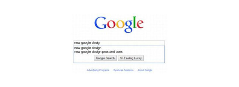
Every new innovation is either accepted or rejected widely. Recently, the new Google Design was launched for users worldwide in 26 different languages. The new Google Design has been accepted worldwide by many users but some of the loyal users have also spotted some major discrepancies in the new design of Google. Let us first take you through the different features and changes that have been introduced in the new design.
- One of the major changes is the appearance of the word Google. The Google logo is now larger and brighter and the shadow outline is reduced to give it less prominence. The overall effect gives a modern appearance.
- The search input box is bigger and more pronounced.
- In the new design, you will not have to click on the Search More Options button to display the left hand side of the search page. It appears there by default with options such as blogs, discussions, images, updates, books, related searches etc.
The above mentioned are some of the major differences apart from the changes in functionality, which has improved considerably. Though widely and enthusiastically accepted by users and navigators, we will take you through the various advantages and disadvantages of the new Google Design in relation to its impact on SEO (Search Engine optimization).
The Major Advantages Would Be :
One of the major advantages is that the new Google Design offers some of the hidden aspects of the search on the main menu. The most prominent and important would be the position of the blog results and the new discussion items displayed on the menu. This makes the search broader and more extensive. ? The similar results are now more accurate and useful and the searchers now have more options for their search. The search produces results, which otherwise would not have shown on the menu. As you cannot be everywhere at once, it takes a bit of an effort to find the most accurate search result.
The Major Disadvantages:
The new Google hurts major sites, which contain long tail phrases as the search becomes too complex, revealing too many results. The new Google Design is being dismissed by some as being too cluttered and messy. The tools and options embedded on the left side of the menu are more or less redundant as they are attractive but not very useful.
After receiving positive and negative responses, there is still time to decide whether the new Google Design is impressive and acceptable or ineffective and a dud.

