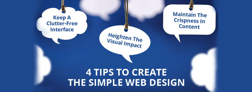
In order to prettify something, you can't throw all the adornments at it once or else it will end up looking loud and gaudy. Same is the case with your website. The more elaborate and multi-faceted design you choose, the more it weakens the marketing and branding efforts thereby reducing the conversion rates. Simplicity works for the website; focus on the basic stuff and it will keep it running hard, sharp and true to the aspirations of your customers.
In order to enrich the web design with the simple sophistication, the Web Designers can refer to the below the mentioned tips:
Keep A Clutter-Free Interface
- The online readers and visitors possess a mind as innocent as a child. They need the bare essential functionalities that justify the brand and its wares & services. Nothing more! The rest of the clutter and complexities on the web page distracts the users from the much significant information and induce them to leave the page.
- Apply the 80-20 Pareto principle, which prompts to eliminate the 80% of those website elements and click-away options that derive mere 20% results. It can be anything from the tedious sidebars, links in the footers, social media sharing widgets, etc. After lessening the distractions, you'll leave visitors with bare excuses to leave the page.
Maintain The Crispness In Content
- The message delivered by the website's content should contain the right level of knowledge, naivety, and inquisitiveness instead of confusing them with the unnecessary or flamboyant details. Most of the web designers tend to churn out their web design with the abundance of objectives, information, explanation and charts thereby losing the childlike simplicity.
- The renowned personality, Emma Godfrey urges people to adopt a straightforward approach and adhere to the KISS or Keep It Simple, Stupid principle. The web content should engage the users interest and drive them to the desired outcome, or sales funnel, or call to action. For this, boil your content to the essential that contains only impactful verbs, touching anecdotes, real-life examples over the extra & space-occupying details. Moreover, the chief content should be tactically placed on the above fold of the web pages.
Heighten The Visual Impact
- Your fussy audience will love you for incorporating more and more catchy visuals to your web design. They play a nice supplement to your extra content and are good for the visitors who prefer to glide through the web information and land straight to the point they're looking for.
- Integrate the text with the striking and evocative images and videos that are easy to buffer, and convey a lot. Also, to enhance the readability of the content, keep the simple typeface, and bulleted information. What is more, you should stick to a simple color scheme with the ample of white space in order to offer the breathing space to the web content.
Create A Smooth-Sailing Navigation Experience
- The complex and protracted navigation procedure lead the prospective customers to slip away from the website. If your web design is not letting the visitors reach the targeted page in the quick 5 seconds, its probably the indication that you need to rework on your website's navigation.
- In order to create a smoothly-sailing navigation experience, the first thing you need to do is to unload the junk from your web design. It can be anything from those web page navigation that forces the user to tediously switch the multiple pages and consequently, even the website. Instead, you can go for the infinite scrolling option that displays everything on the single page. However, remember to branch off sections in your website for the easy guidance.
By means of applying these easy tricks, you can regain the simplicity in your web design that will fairly help to seize the interest of your target audience. Either employ all of them at once, or go for the hit-and-trial method that will give you a clear knowledge of what's good for the website and what's not.


9 thoughts on "4 Tips To Create The Simple Web Design"
thskxfdm
13 November, 2024 at 9:51 pm
This is such a well-written blog post!
Cancel
Reply
Atharv Singh
03 October, 2024 at 4:09 am
Looking forward to more blogs like this one!
Cancel
Reply
Nitish
15 March, 2018 at 6:48 am
Great Post & thanks for sharing.
Cancel
Reply
Anurag Gupta
15 September, 2016 at 5:29 am
You can start with enriching the content of your website. It will not take much of your effort, and you will be able to get the best outcomes without stretching the budget. Additionally, you can also sharpen up your website images with the help of free tools available online.
Cancel
Reply
dvlper
15 September, 2016 at 8:35 am
Now a days all the people are using mobile phone to share their ideas and various purposes, so mobile apps are developed more important ;this article gives good ideas for developing iOS apps for mobile this is very useful for me to develop our own apps.
Cancel
Reply
Web framez
31 August, 2016 at 11:32 am
your article is really incredible. I really admire you for your this article.
Cancel
Reply
Nikita bhoite
25 August, 2016 at 9:26 am
I want know that where am i change in my website to look good and best in design thank you for sharing information.
Cancel
Reply
URGID
20 August, 2016 at 10:46 am
Best of details to get started with. good work ..
Cancel
Reply
Website Design Companies In Coimbatore
11 August, 2016 at 11:47 am
web designing is the art, thank you narrating the brief note on simple web design
Cancel
Reply